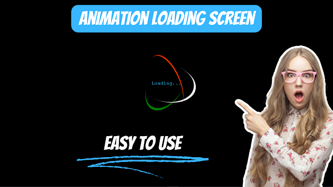
.png)

Html :~
<!DOCTYPE html>
<html>
<head>
<meta charset="UTF-8">
<meta http-equiv="X-UV-Compatible" content="IE=edge">
<meta name="viewport" content="width=device-width,initial-scale=1.0">
<title>animation loader</title>
<link rel="stylesheet" href="style.css">
</head>
<body>
<div class="container">
<div class="ring"></div>
<div class="ring"></div>
<div class="ring"></div>
<span class="loading">Loading...</span>
</div>
</body>
</html>
Css:~
*{
margin:0;
padding: 0;
box-sizing: border-box;
}
body{
height: 100vh;
width: 100%;
display: flex;
justify-content: center;
align-items: center;
background-color: #000;
}
.container{
position: relative;
display: flex;
justify-content: center;
align-items: center;
}
.ring{
width: 200px;
height: 200px;
border: 0px solid #000;
border-radius: 50%;
position: absolute;
}
@keyframes rotate1{
0%{
transform: rotateX(35deg) rotateY(-45deg) rotateZ(0deg);
}100%{
transform: rotateX(35deg) rotateY(-45deg) rotateZ(360deg);
}
}
@keyframes rotate2{
0%{
transform: rotateX(50deg) rotateY(10deg) rotateZ(0deg);
}100%{
transform: rotateX(50deg) rotateY(10deg) rotateZ(360deg);
}
}
@keyframes rotate3{
0%{
transform: rotateX(35deg) rotateY(55deg) rotateZ(0deg);
}100%{
transform: rotateX(35deg) rotateY(55deg) rotateZ(360deg);
}
}
.ring:nth-child(1){
border-bottom-width: 8px;
border-color: green;
animation: rotate1 2s linear infinite;
-webkit-animation: rotate1 2s linear infinite;
}
.ring:nth-child(2){
border-right-width: 8px;
border-color: rgb(255, 255, 255);
animation: rotate2 2s linear infinite;
-webkit-animation: rotate2 2s linear infinite;
}
.ring:nth-child(3){
border-top-width: 8px;
border-color: rgb(255, 51, 0);
animation: rotate3 2s linear infinite;
-webkit-animation: rotate3 2s linear infinite;
}
.loading{
color: #2acaff;
font-family: 'Courier New', Courier, monospace;
}
Output :~
Click Hear
.png)


.png)
